Logo design and branding can sometimes almost be an afterthought for a new business. When you’re starting up, the costs add up, you’re really time-poor, and you might need to save where you can.
You may be in a hurry to get your logo design done. You’ve got loads to think about and to invest in. You’ve heard that you can hop onto websites and get a logo done quickly and cheaply. Or you might be tempted to give it a go yourself in Canva.
In fact, I’ve had a handful of clients do exactly this. And I completely understand why. But here’s why it’s not worth it. Ever!
Here’s why it’s not worth skimping on your logo design…
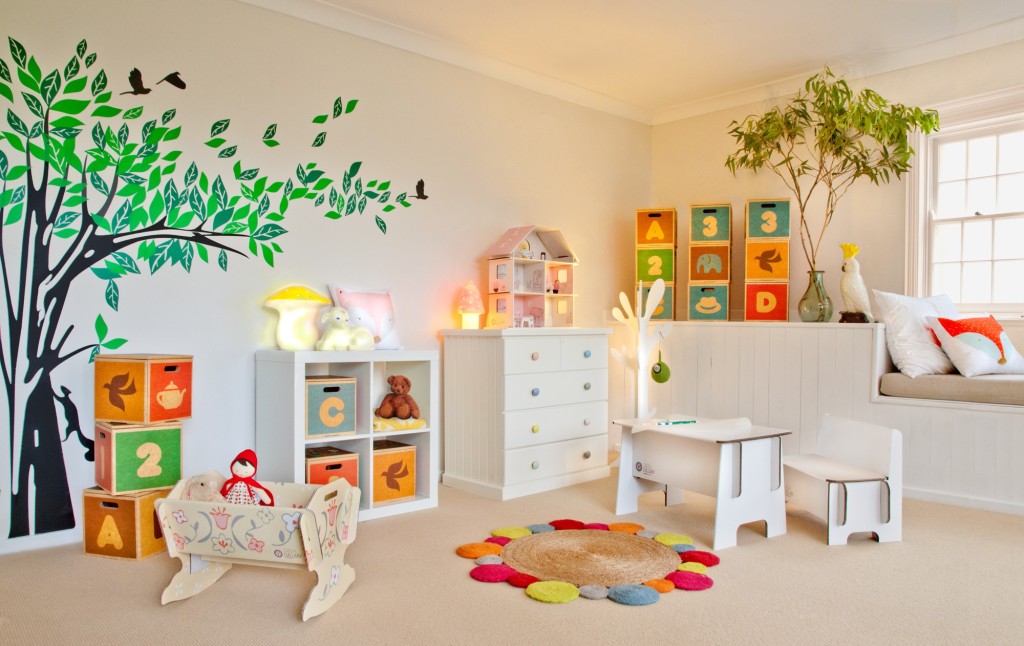
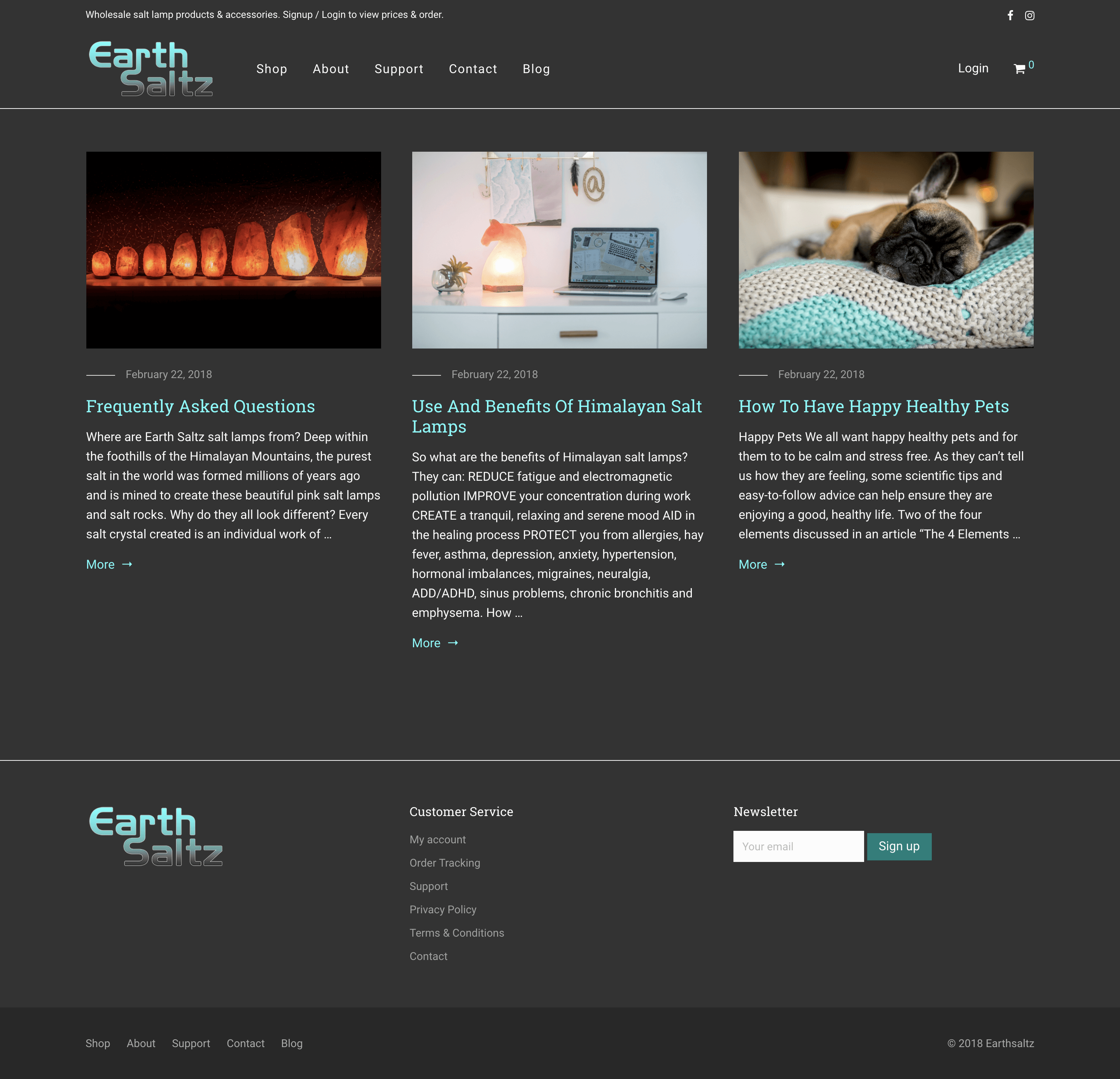
I built an e-commerce site for a new client, Earth Saltz, and a different company was designing the logo. When it is done right, that’s no problem! But when it was sent through, I knew I had to recommend it to be redone. Why?
- It looked unprofessional and the colours were jarring.
- There was no rationale behind it.
- It didn’t fit with the ethos of the brand.
- When I asked to see other versions, there was only one other.
- A jpeg was the only file supplied.
Your brand is everything. It will carry through from your website to social media, to printed material such as business cards and even car ads and signs.
Each medium or platform will require different logo design files for web and print. We have had to create correct files on numerous occasions, meaning it isn’t the cost-saver you expected it to be.
7 Things That Should Be Part Of Your Logo Design Package
- A proper consultation with a design brief to complete.
- Multiple design options to choose from (number depends on the level of package.)
- At least one round of revisions to your preferred design.
- Supplied with all file formats for digital and print e.g. colour, mono and reverse options.
- You would expect to get .png .jpg .eps and .ai files. Sometimes PDFs are provided too
- A style guide with colours and names of fonts used.
- The colour guide should include Pantone, CMYK, RGB and hex codes.
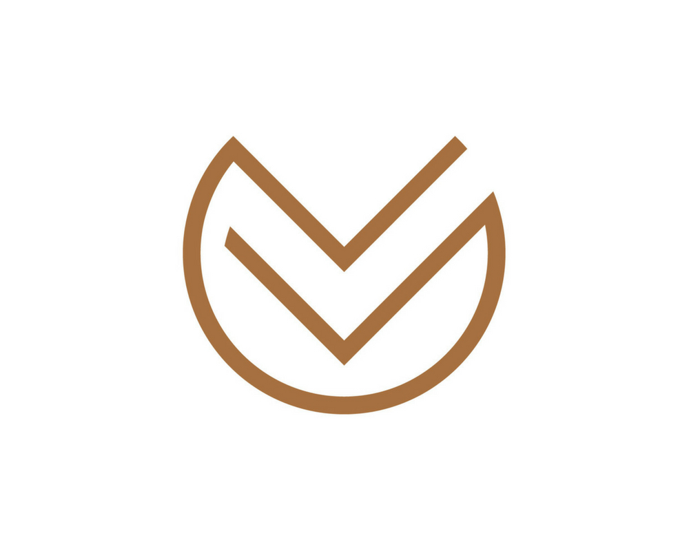
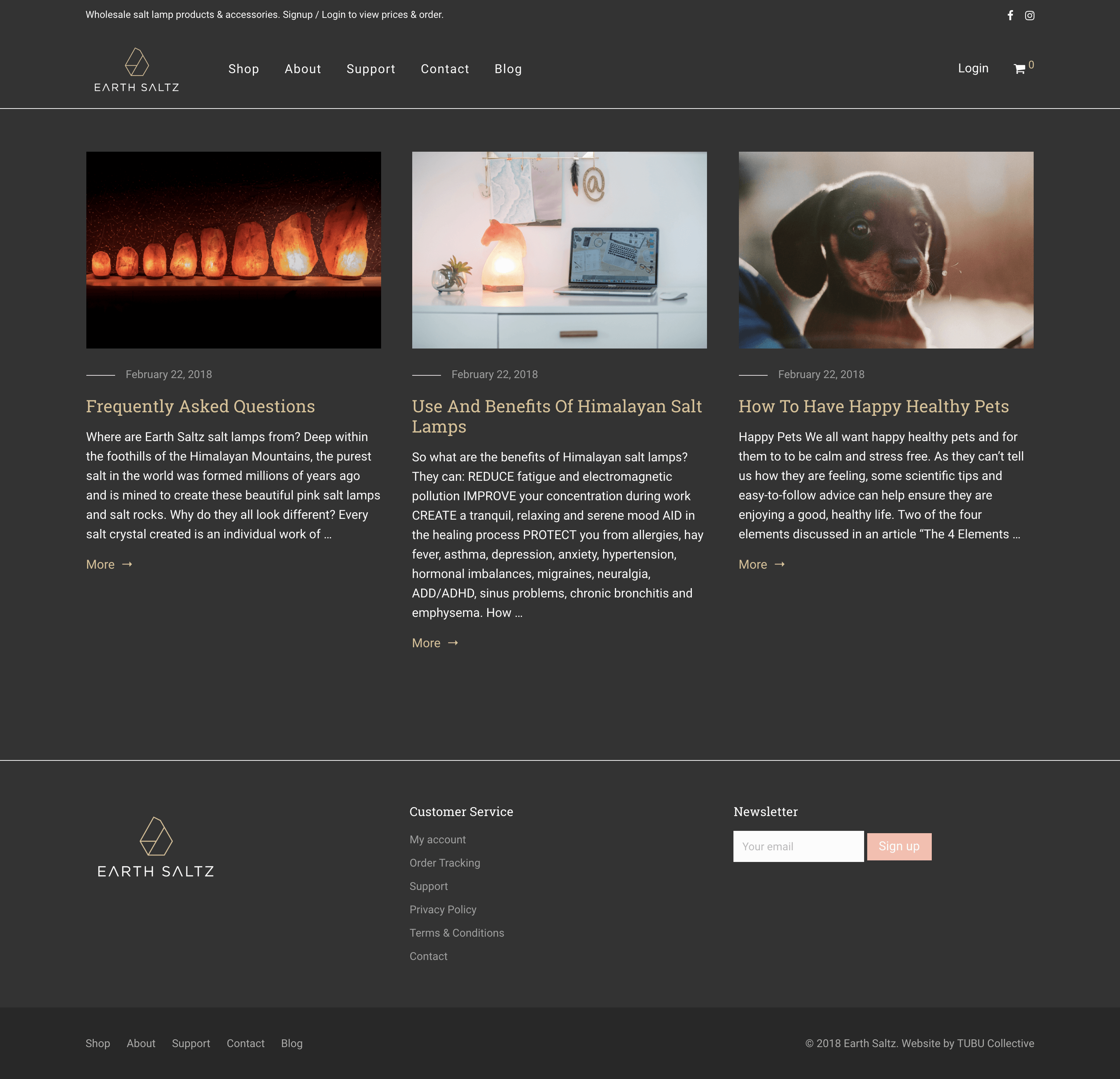
The Revised New Logo Design
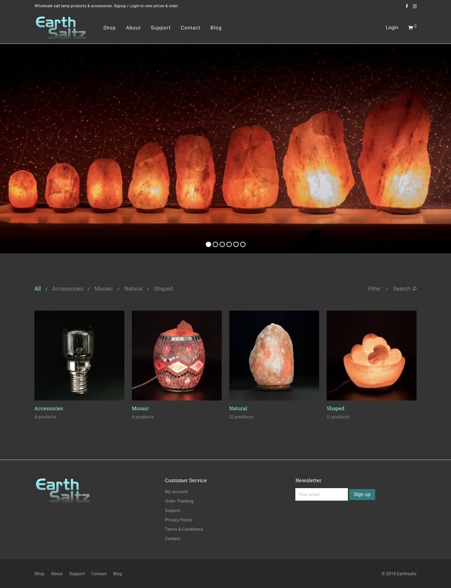
TUBU Collective redid the original logo for Earth Saltz after a few months of trading. They now have a completely beautiful-looking website and brand which has a story and rationale behind it.
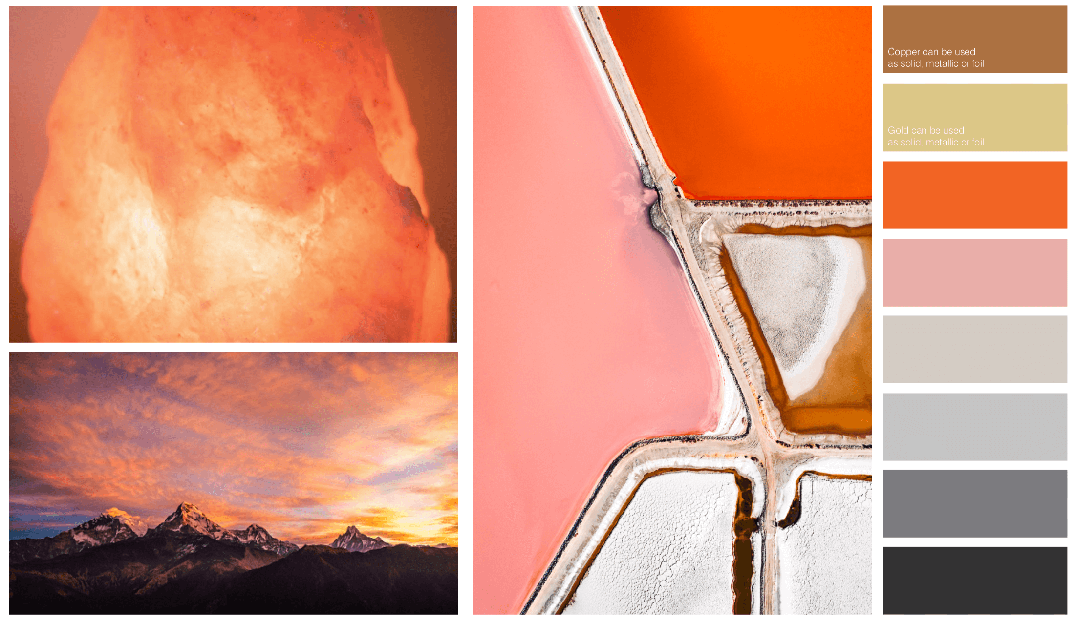
Every salt crystal created is an individual work of art and unique in its own colour, design and shape. Himalayan mineral salt is unique in that the crystals form perfect geometric patterns.
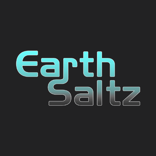
The design draws inspiration from the beautiful salt lamp products by crafting a unique geometric symbol, abstractly drawn from the natural shaped lamps. The A’s in the typography are simplified to represent the Himalayan mountain peaks.
The new logo design absolutely captures what the owners feel and love about their business. What’s more, we know all the font names, colours, and have all the right assets to be able to work with this across the whole business, for a consistent brand message.
In summary, you may feel like you are saving money by opting for a quick or cheap option for your new logo design, but it will absolutely cost more in the long run.
Keen to rebrand or get a new logo design for your business? Get in touch, I’d love to help. Want to see more? Here’s another case study on a logo for a start-up business who had two failed agency designs before coming to us!