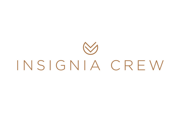
We were approached to redesign the logo of a one-year-old business called Insignia Crew.
At the time, they were just using a simple font but really wanted a proper, sophisticated logo with a symbol that could be used for social media profiles, corporate polo shirts, stationery, and so on. They also needed all the necessary files for print so that they could embark on sponsorships.
The Logo Challenge
To add to the normal challenge of fulfilling a client’s logo dreams, Insignia Crew had already been through the logo design process twice with different agencies (with no success.)
The Logo Brief
We were supplied with a very detailed brief. In a way, this was a good thing as they knew exactly what they did and didn’t like. But it also meant we weren’t free to explore certain avenues. With such detail came a huge responsibility to get it right!
However, after the first round of concepts, the logo was approved!

Design Thinking
The new logo design is quite geometric and abstract. It uses the Insignia ranking/symbol and also depicts key elements and qualities such as premium, classic, unity, and rankings.
You may notice an abstract “handshake” element and the insignia lines also look like arms supporting each other to represent the crew element of the business. It is a strong design and can easily work across various aspects of the business.

So, what did the client think of it?
Client Feedback
“Well, you’ve nailed it, and thank goodness for that! ” says Annalise Holme, Director of Insignia Crew. “I don’t think my nerves or patience could have coped with briefing another designer if it hadn’t worked out. I was so nervous opening your attachment and was praying there would be a corker in there, and there was!“
“It’s a simple/non-fussy and clever design, geometrically pleasing to the eye, incorporates the insignia really well, the circle around it softens it, it’s classy and modern but timeless.”
Read more about our logo design service and get in touch if you’re keen for a revamp!

